The axis that lies
Last week I was reading the PISA coverage in De Standaard - the one about the reading skills of Flemish 15-year-olds, which is not a happy read for a dad - and something in the charts made me stop. The vertical axis didn't start at zero. It started at 450. And my first reaction was: here we go again. Another newspaper zooming in on a sliver of the scale to make a line look like it fell off a cliff.
I'll tell you next week what I found when I actually checked that one (spoiler: it's more interesting than I expected). But the reflex itself was justified, because this trick is everywhere. And on a site that exists because the news is skewed towards the negative, I think it deserves an editorial of its own. So let me start with the offenders.
The oldest trick in the book
Here's the thing. A bar chart works because your brain compares the length of the bars. That is the whole point of a bar chart. If one bar is twice as long as the other, you read "twice as much" before you have consciously looked at a single number. Which is exactly why cutting the bottom off the axis is so effective: the bars keep their proportions to each other in your head, but those proportions are now fiction.
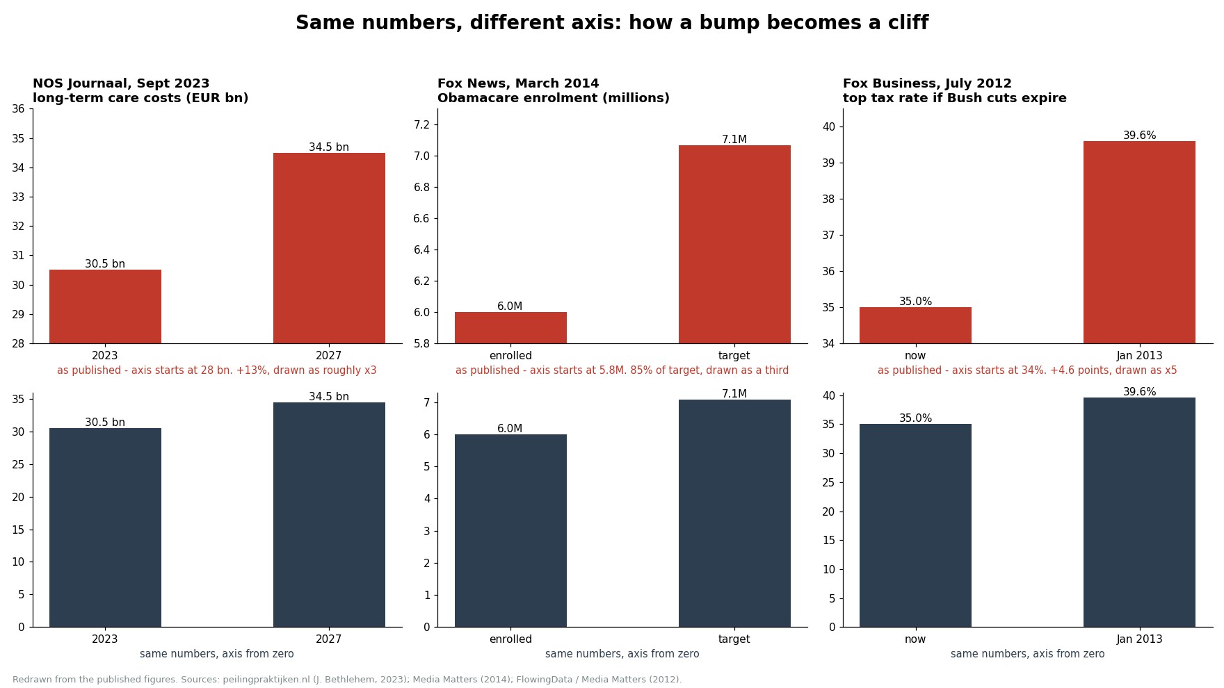
Darrell Huff wrote about this in How to Lie with Statistics in 1954. Seventy years later, it still works every single time. The three cases in the picture above are my favourites, simply because they are so well documented.
The Dutch care costs that tripled (they didn't)
On 5 September 2023, the NOS eight o'clock news showed the cost of long-term care in the Netherlands going from €30.5 billion in 2023 to €34.5 billion in 2027. That is a 13 percent increase. On screen, the 2027 bar was about three times the height of the 2023 bar, because the axis quietly started at 28. Jelke Bethlehem, emeritus professor of survey methodology in Leiden, took it apart on his blog - and then had to do it again a day later for a temperature chart on the same channel.
The American classics
If you want the textbook cases, go to Fox News. In March 2014 they showed Obamacare enrolment: 6 million people signed up against a target of 7 million. On screen, the target bar was about three times taller. Fox aired a correction the next day, calling it "our mistake". Two years earlier, Fox Business had shown what would happen if the Bush tax cuts expired: the top rate going from 35 percent to 39.6 percent, on an axis starting at 34, so that a 4.6-point increase looked like a fivefold jump.
Closer to home
We are not innocent in Belgium either. In March 2018 De Morgen ran a piece headlined "Jonge gezinnen ontvluchten de stad", with a line chart of young families in Antwerp. The axis ran from 12,000 to 17,000, turning a modest rise and a slight dip into a dramatic exodus. Bethlehem called it a fake graph and redrew it - and redrawn from zero, what is left is a gentle rise and a gentler dip. Hardly an exodus.
In September 2018, VRT NWS showed the Swedish election results with three bars that had no scale at all: the Sweden Democrats, at 17.6 percent, got a bar almost as tall as the two big blocs that had more than twice their vote. And in January 2017 State Secretary Theo Francken's party put out a two-bar chart showing regularisation requests in "vrije val" thanks to his €250 fee - by squashing a three-year average into one bar and comparing it with a single year, which conveniently hid that the decline had started years before the fee. De Morgen called it a "kwakkelende grafiek", and rightly so.
Politicians I can almost forgive; they are selling something. Newsrooms are supposed to be selling the truth.
And it isn't only about chopping the axis. Reuters once flipped the axis upside down on a chart of gun deaths in Florida, so that a rise after the "Stand Your Ground" law looked, at a glance, like a fall. National Review did the opposite trick with the climate: they tweeted a chart of global temperature on an axis running from well below freezing to well above 100°F, and hey presto, global warming flatlined. And Tim Cook, on stage in 2013, showed a beautifully rising curve of cumulative iPhone sales - a curve that can never go down - while quarterly sales had actually declined three quarters in a row.
Why this matters more than it used to
None of this is new. What is new is the economics. A chart that shows a cliff gets shared; a chart that shows a gentle slope does not. Every newsroom now lives off clicks, and the chart is the most shareable thing on the page. It travels on its own, without the article, without the caption, without the nuance. The truncated axis is the visual version of the clickbait headline, except that it is harder to spot and it feels more objective. Numbers don't lie, right?
Well. Numbers don't. Axes do.
This is, of course, the same mechanism we keep coming back to on Positron. Our brains react more strongly to a threat than to a piece of good news, and a steep red line is a threat. The people who make the charts know this, whether they admit it to themselves or not. Cutting the axis is a cheap way of pushing the negativity button.
The nice thing is that the fix is just as cheap. Researchers at Leiden University tested what helps people see through a misleading chart, and the most effective correction was simply putting the honest chart next to the misleading one. Once you've seen the pair, you can't unsee it.
So the next time a chart makes your stomach drop, do one thing before you share it: look at the bottom-left corner. If the number there isn't zero, and the chart is made of bars, somebody is trying to make you feel something the data does not support.
And the PISA chart that started all of this? That one, it turns out, deserves a defence. More on that next week.
Hope this was a useful reflection - as always, would love to hear what you think.
Cheers
Rik
De as die liegt
Vorige week las ik de PISA-coverage in De Standaard - de artikel over de leesvaardigheden van Vlaamse 15-jarigen, wat geen vrolijke lectuur is voor een vader - en iets in de grafieken deed me stoppen. De verticale as begon niet bij nul. Hij begon bij 450. En mijn eerste reactie was: daar gaan we weer. Een andere krant die inzoomt op een klein stukje van de schaal om een lijn eruit te laten zien alsof hij van een klif is gevallen.
Ik zal je volgende week vertellen wat ik vond toen ik dat daadwerkelijk controleerde (spoiler: het is interessanter dan ik verwachtte). Maar de reflex zelf was gerechtvaardigd, want deze truc is overal. En op een site die bestaat omdat het nieuws scheefgetrokken is naar het negatieve, denk ik dat het een eigen editorial verdient. Laat me dus beginnen met de overtreders.
De oudste truc in het boek
Hier is het punt. Een staafdiagram werkt omdat je hersenen de lengte van de staven vergelijken. Dat is het hele punt van een staafdiagram. Als één staaf twee keer zo lang is als de andere, lees je "twee keer zoveel" voordat je bewust naar een enkel nummer hebt gekeken. En dat is precies waarom het afsnijden van de onderkant van de as zo effectief is: de staven behouden hun verhoudingen tot elkaar in je hoofd, maar die verhoudingen zijn nu fictie.
Darrell Huff schreef hierover in How to Lie with Statistics in 1954. Zeventig jaar later werkt het nog steeds elke keer. De drie gevallen in de afbeelding hierboven zijn mijn favorieten, simpelweg omdat ze zo goed gedocumenteerd zijn.
De Nederlandse zorgkosten die verdrievoudigden (dat deden ze niet)
Op 5 september 2023 toonde het NOS acht uur nieuws de kosten van langdurige zorg in Nederland die van €30,5 miljard in 2023 naar €34,5 miljard in 2027 gingen. Dat is een stijging van 13 procent. Op het scherm was de staaf voor 2027 ongeveer drie keer zo hoog als de staaf voor 2023, omdat de as stilletjes begon bij 28. Jelke Bethlehem, emeritus hoogleraar surveymethodologie in Leiden, nam het onder de loep op zijn blog - en moest het de volgende dag opnieuw doen voor een temperatuurgrafiek op hetzelfde kanaal.
De Amerikaanse klassiekers
Als je de schoolboekgevallen wilt, ga dan naar Fox News. In maart 2014 toonden ze de inschrijvingen voor Obamacare: 6 miljoen mensen schreven zich in tegen een doel van 7 miljoen. Op het scherm was de doelstaaf ongeveer drie keer zo hoog. Fox uitzond de volgende dag een correctie, en noemde het "onze fout". Twee jaar eerder had Fox Business getoond wat er zou gebeuren als de belastingverlagingen van Bush zouden vervallen: het hoogste tarief dat van 35 procent naar 39,6 procent ging, op een as die begon bij 34, zodat een stijging van 4,6 punten eruitzag als een vijfvoudige sprong.
Dichter bij huis
We zijn ook niet onschuldig in België. In maart 2018 publiceerde De Morgen een stuk met de titel "Jonge gezinnen ontvluchten de stad", met een lijngrafiek van jonge gezinnen in Antwerpen. De as liep van 12.000 tot 17.000, waardoor een bescheiden stijging en een lichte dip werden omgevormd tot een dramatische exodus. Bethlehem noemde het een nep-grafiek en hertekende het - en hertekend vanaf nul, wat overbleef was een zachte stijging en een zachtere dip. Bijna geen exodus.
In september 2018 toonde VRT NWS de Zweedse verkiezingsresultaten met drie staven die helemaal geen schaal hadden: de Zweden Democraten, met 17,6 procent, kregen een staaf die bijna net zo hoog was als de twee grote blokken die meer dan twee keer hun stemmen hadden. En in januari 2017 publiceerde de partij van staatssecretaris Theo Francken een grafiek met twee staven die de regularisatieverzoeken in "vrije val" toonden dankzij zijn €250 vergoeding - door een gemiddelde van drie jaar in één staaf te persen en dit te vergelijken met een enkel jaar, wat handig verhulde dat de daling jaren voor de vergoeding was begonnen. De Morgen noemde het een "kwakkelende grafiek", en terecht.
Politici kan ik bijna vergeven; zij verkopen iets. Nieuwsredacties zouden de waarheid moeten verkopen.
En het gaat niet alleen om het afsnijden van de as. Reuters draaide de as ondersteboven op een grafiek van vuurwapendoden in Florida, zodat een stijging na de "Stand Your Ground"-wet er op het eerste gezicht uitzag als een daling. National Review deed de tegenovergestelde truc met het klimaat: ze tweeten een grafiek van de wereldwijde temperatuur op een as die van ver onder het vriespunt tot ver boven de 100°F liep, en kijk, de opwarming van de aarde was gestabiliseerd. En Tim Cook, op het podium in 2013, toonde een prachtig stijgende curve van cumulatieve iPhone-verkopen - een curve die nooit kan dalen - terwijl de kwartaalverkopen daadwerkelijk drie kwartalen op rij waren gedaald.
Waarom dit belangrijker is dan vroeger
Dit is allemaal niet nieuw. Wat nieuw is, zijn de economieën. Een grafiek die een klif laat zien, wordt gedeeld; een grafiek die een zachte helling laat zien, niet. Elke nieuwsredactie leeft nu van klikken, en de grafiek is het meest deelbare ding op de pagina. Het reist op zichzelf, zonder het artikel, zonder de bijschrift, zonder de nuance. De afgeknotte as is de visuele versie van de clickbait-kop, behalve dat het moeilijker te spotten is en het objectiever aanvoelt. Cijfers liegen niet, toch?
Nou. Cijfers niet. Assen wel.
Dit is natuurlijk hetzelfde mechanisme waar we steeds weer op Positron op terugkomen. Onze hersenen reageren sterker op een bedreiging dan op een goed nieuwsbericht, en een steile rode lijn is een bedreiging. De mensen die de grafieken maken, weten dit, of ze het nu voor zichzelf toegeven of niet. Het afsnijden van de as is een goedkope manier om de negativiteitsknop in te drukken.
Het mooie is dat de oplossing net zo goedkoop is. Onderzoekers van de Universiteit Leiden testten wat helpt mensen door een misleidende grafiek heen te kijken, en de meest effectieve correctie was simpelweg de eerlijke grafiek naast de misleidende te plaatsen. Zodra je het paar hebt gezien, kun je het niet meer ongedaan maken.
Dus de volgende keer dat een grafiek je maag doet omdraaien, doe één ding voordat je het deelt: kijk naar de linksonderhoek. Als het nummer daar niet nul is, en de grafiek bestaat uit staven, probeert iemand je iets te laten voelen dat de data niet ondersteunt.
En de PISA-grafiek die dit allemaal begon? Die verdient, zo blijkt, een verdediging. Meer daarover volgende week.
Ik hoop dat dit een nuttige reflectie was - zoals altijd, ik hoor graag wat je ervan vindt.
Groeten
Rik
L'axe qui ment
La semaine dernière, je lisais la couverture de PISA dans De Standaard - celle sur les compétences en lecture des jeunes Flamands de 15 ans, ce qui n'est pas une lecture réjouissante pour un père - et quelque chose dans les graphiques m'a fait m'arrêter. L'axe vertical ne commençait pas à zéro. Il commençait à 450. Et ma première réaction a été : encore une fois. Un autre journal zoomant sur une partie de l'échelle pour faire en sorte qu'une ligne semble avoir chuté d'une falaise.
Je vous dirai la semaine prochaine ce que j'ai trouvé quand j'ai réellement vérifié cela (spoiler : c'est plus intéressant que je ne l'attendais). Mais le réflexe lui-même était justifié, car ce truc est partout. Et sur un site qui existe parce que les nouvelles sont biaisées vers le négatif, je pense qu'il mérite un éditorial à part entière. Alors permettez-moi de commencer par les coupables.
Le plus vieux truc du livre
Voici le truc. Un graphique à barres fonctionne parce que votre cerveau compare la longueur des barres. C'est tout l'intérêt d'un graphique à barres. Si une barre est deux fois plus longue que l'autre, vous lisez "deux fois plus" avant même d'avoir regardé consciemment un seul chiffre. C'est exactement pourquoi couper le bas de l'axe est si efficace : les barres conservent leurs proportions entre elles dans votre tête, mais ces proportions sont désormais fictives.
Darrell Huff en a parlé dans Comment mentir avec des statistiques en 1954. Soixante-dix ans plus tard, cela fonctionne encore à chaque fois. Les trois cas dans l'image ci-dessus sont mes préférés, simplement parce qu'ils sont si bien documentés.
Les coûts de santé néerlandais qui ont triplé (ce qui n'est pas le cas)
Le 5 septembre 2023, le journal télévisé de 20 heures de la NOS a montré que le coût des soins de longue durée aux Pays-Bas passait de 30,5 milliards d'euros en 2023 à 34,5 milliards d'euros en 2027. Cela représente une augmentation de 13 pour cent. À l'écran, la barre de 2027 était environ trois fois plus haute que celle de 2023, car l'axe commençait discrètement à 28. Jelke Bethlehem, professeur émérite de méthodologie d'enquête à Leyde, l'a décortiqué sur son blog - et a ensuite dû le faire à nouveau un jour plus tard pour un graphique de température sur la même chaîne.
Les classiques américains
Si vous voulez des cas d'école, allez sur Fox News. En mars 2014, ils ont montré les inscriptions à Obamacare : 6 millions de personnes se sont inscrites contre un objectif de 7 millions. À l'écran, la barre de l'objectif était environ trois fois plus haute. Fox a diffusé une correction le lendemain, l'appelant "notre erreur". Deux ans plus tôt, Fox Business avait montré ce qui se passerait si les réductions d'impôts de Bush expiraient : le taux supérieur passant de 35 pour cent à 39,6 pour cent, sur un axe commençant à 34, de sorte qu'une augmentation de 4,6 points semblait un bond quintuple.
Plus près de chez nous
Nous ne sommes pas innocents non plus en Belgique. En mars 2018, De Morgen a publié un article intitulé "Jonge gezinnen ontvluchten de stad", avec un graphique linéaire des jeunes familles à Anvers. L'axe allait de 12 000 à 17 000, transformant une légère hausse et une légère baisse en un exode dramatique. Bethlehem l'a qualifié de faux graphique et l'a redessiné - et redessiné à partir de zéro, ce qui reste est une légère hausse et une baisse encore plus douce. À peine un exode.
En septembre 2018, VRT NWS a montré les résultats des élections suédoises avec trois barres qui n'avaient pas d'échelle du tout : les Démocrates suédois, à 17,6 pour cent, avaient une barre presque aussi haute que les deux grands blocs qui avaient plus du double de leurs voix. Et en janvier 2017, le parti du secrétaire d'État Theo Francken a publié un graphique à deux barres montrant les demandes de régularisation en "chute libre" grâce à ses frais de 250 € - en compressant une moyenne sur trois ans dans une barre et en la comparant à une seule année, ce qui a commodément caché que le déclin avait commencé des années avant les frais. De Morgen l'a qualifié de "grafiek kwakkelende", et à juste titre.
Je peux presque pardonner aux politiciens ; ils vendent quelque chose. Les rédactions sont censées vendre la vérité.
Et il ne s'agit pas seulement de couper l'axe. Reuters a un jour retourné l'axe à l'envers sur un graphique des décès par arme à feu en Floride, de sorte qu'une augmentation après la loi "Stand Your Ground" semblait, à première vue, une baisse. National Review a fait le truc inverse avec le climat : ils ont tweeté un graphique de la température mondiale sur un axe allant bien en dessous de zéro à bien au-dessus de 100°F, et hop, le réchauffement climatique s'est stabilisé. Et Tim Cook, sur scène en 2013, a montré une courbe magnifiquement ascendante des ventes cumulées d'iPhone - une courbe qui ne peut jamais descendre - tandis que les ventes trimestrielles avaient en réalité diminué trois trimestres de suite.
Pourquoi cela compte plus qu'auparavant
Rien de tout cela n'est nouveau. Ce qui est nouveau, ce sont les économies. Un graphique qui montre une falaise est partagé ; un graphique qui montre une pente douce ne l'est pas. Chaque rédaction vit maintenant des clics, et le graphique est la chose la plus partageable sur la page. Il voyage tout seul, sans l'article, sans la légende, sans la nuance. L'axe tronqué est la version visuelle du titre accrocheur, sauf qu'il est plus difficile à repérer et qu'il semble plus objectif. Les chiffres ne mentent pas, n'est-ce pas ?
Eh bien. Les chiffres ne mentent pas. Les axes, si.
C'est, bien sûr, le même mécanisme que nous continuons à retrouver sur Positron. Nos cerveaux réagissent plus fortement à une menace qu'à une bonne nouvelle, et une ligne rouge raide est une menace. Les personnes qui créent les graphiques le savent, qu'elles l'admettent ou non. Couper l'axe est un moyen bon marché de pousser le bouton de la négativité.
La bonne nouvelle, c'est que la solution est tout aussi bon marché. Des chercheurs de l'Université de Leyde ont testé ce qui aide les gens à voir à travers un graphique trompeur, et la correction la plus efficace était simplement de mettre le graphique honnête à côté de celui trompeur. Une fois que vous avez vu la paire, vous ne pouvez plus l'ignorer.
Alors la prochaine fois qu'un graphique vous fait tomber l'estomac, faites une chose avant de le partager : regardez dans le coin inférieur gauche. Si le chiffre là-bas n'est pas zéro, et que le graphique est composé de barres, quelqu'un essaie de vous faire ressentir quelque chose que les données ne soutiennent pas.
Et le graphique PISA qui a tout déclenché ? Celui-là, il s'avère, mérite une défense. Plus là-dessus la semaine prochaine.
J'espère que cela a été une réflexion utile - comme toujours, j'aimerais savoir ce que vous en pensez.
Cordialement
Rik