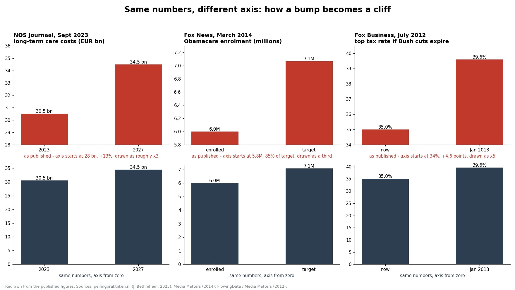
Last week, I stumbled upon a PISA article that highlighted the reading skills of Flemish 15-year-olds, and I noticed something curious about the charts. The vertical axis didn't start at zero, which made the data look far worse than it actually is. This trick of manipulating the axis is everywhere, and it’s time we shed light on it. It’s fascinating how a simple change can skew our perception of the truth.Vorige week stuitte ik op een PISA-artikel dat de leesvaardigheid van Vlaamse 15-jarigen belichtte, en ik merkte iets curios op aan de grafieken. De verticale as begon niet bij nul, waardoor de gegevens veel erger leken dan ze in werkelijkheid zijn. Deze truc van het manipuleren van de as is overal, en het is tijd om hier licht op te werpen. Het is fascinerend hoe een simpele verandering onze perceptie van de waarheid kan vertekenen.La semaine dernière, je suis tombé sur un article PISA qui mettait en avant les compétences en lecture des jeunes Flamands de 15 ans, et j'ai remarqué quelque chose de curieux dans les graphiques. L'axe vertical ne commençait pas à zéro, ce qui rendait les données beaucoup plus négatives qu'elles ne le sont réellement. Cette astuce de manipulation de l'axe est partout, et il est temps d'en parler. C'est fascinant de voir comment un simple changement peut fausser notre perception de la vérité.